UI/UX Design for B2B SaaS — What Actually Converts
Here's an uncomfortable truth about B2B SaaS design: your users don't care if your product looks beautiful. They care if it makes them look competent to their boss. They care if it saves them 20 minutes a day. They care if they can figure it out without reading documentation.
At SyntaxErreur, we've designed interfaces for SaaS products across real estate, education, and enterprise workflows. The patterns that convert in B2B are fundamentally different from B2C — and most design teams get them wrong.
Enterprise buyers don't care about pretty gradients. They care about clarity, speed, and trust.
The B2B Design Mindset Shift
B2C design optimizes for delight. B2B design optimizes for efficiency. Your users are at work. They have 47 tabs open, a meeting in 15 minutes, and a quarterly target breathing down their neck. Every extra click, every ambiguous label, every unnecessary animation is friction.
Design for the Evaluator, Not Just the User
In B2B, the person who buys your product is often different from the person who uses it. Your design needs to impress the VP watching the demo and the analyst using it 8 hours a day. That means:
- Clean, professional aesthetics that signal "enterprise-ready"
- Clear dashboards and reports that VPs can screenshot for board decks
- Power-user features (keyboard shortcuts, bulk actions, saved views) that daily users need
The 7 Design Patterns That Actually Convert
1. Progressive Disclosure
Don't show everything at once. Start with the essential actions and reveal complexity as users need it. A clean default view with an "Advanced" toggle beats a cluttered interface that tries to show every option simultaneously.
Example: A filter panel that shows 3 common filters by default, with a "More filters" expansion for the other 12.
2. Empty States That Onboard
The first time a user sees any screen, it's empty. That empty state is your biggest onboarding opportunity — and most SaaS products waste it with a generic "No data yet" message.
Use empty states to: explain what the screen does, show what it looks like with data, and provide a single clear action to get started.
3. Data-Dense Defaults
B2B users want more information, not less. They're making decisions — give them the data to make them. Tables with sortable columns, inline metrics, comparison views. Don't hide useful data behind clicks to look "clean."
B2B users want more information, not less. Don't hide useful data behind clicks to look "clean."
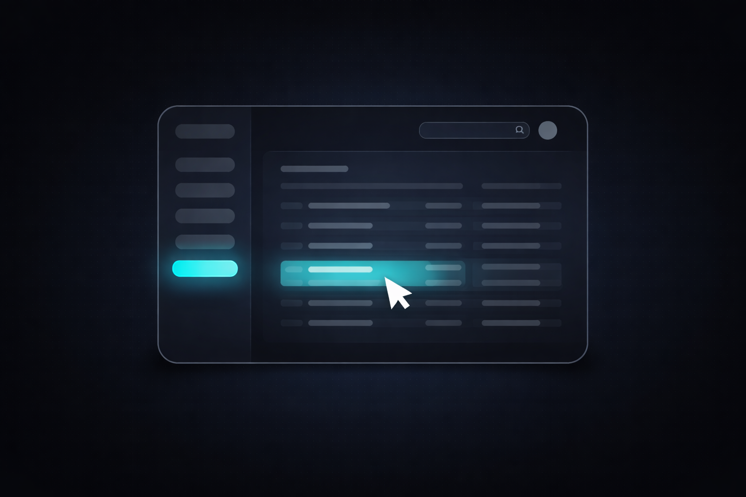
4. Consistent Navigation Patterns
A B2B user might interact with 15-20 different screens daily. If every screen has a different layout pattern, they waste cognitive energy re-orienting. Establish consistent patterns:
- Same position for primary actions (top-right)
- Same table/list patterns across all data views
- Same form layout for all create/edit flows
- Same notification and feedback patterns
5. Inline Editing Over Modals
Every modal is a context switch. If a user needs to edit a field, let them click it and edit inline. Save automatically. Don't force them through a create → modal → fill form → save → close cycle for a one-field change.
6. Actionable Dashboards
Dashboards that only display metrics are useless. Every number on a dashboard should answer: "So what? What do I do about this?" Pair metrics with:
- Contextual comparisons (vs. last period, vs. goal)
- Trend indicators (up/down arrows with magnitude)
- Direct action links ("3 deals closing this week → View deals")
7. Trust Signals in the Interface
Enterprise buyers are risk-averse. Your UI needs to signal reliability at every touchpoint:
- Clear save/sync indicators ("All changes saved")
- Audit trails and version history
- Permission indicators (who can see/edit this)
- Data export options (no one wants to feel locked in)
The Design System Advantage
A design system isn't a nice-to-have for B2B SaaS — it's a velocity multiplier. When your engineering team has a library of pre-built, tested components, new features ship in days instead of weeks.
At SyntaxErreur, we build every client project on a bespoke design system that includes:
- Component library: Buttons, inputs, tables, modals, navigation patterns
- Token system: Colors, spacing, typography scales that ensure consistency
- Pattern library: Documented solutions for common UX problems (onboarding flows, settings pages, data visualizations)
- Interaction specs: Loading states, error states, success feedback, empty states
Measuring Design Impact
Good B2B design isn't subjective — it's measurable. The metrics that matter:
- Time to first value: How fast can a new user accomplish their core task?
- Task completion rate: What percentage of users complete key workflows?
- Support ticket volume: Are users figuring things out on their own?
- Feature adoption: Are users discovering and using new capabilities?
- NPS / CSAT scores: Are users satisfied with the experience?
Ready to Design a B2B Product That Converts?
The best B2B SaaS products don't win design awards — they win renewals. They're the products that users defend in budget meetings because they can't imagine doing their job without them.
At SyntaxErreur, we design B2B interfaces that optimize for the metrics that matter: activation, retention, and expansion. If you're building a B2B product and want design that converts, let's talk.
Written by SyntaxErreur Team
We build AI-powered SaaS products for founders — from strategy and design to development and scale.
Related Posts
Need a design that converts?
Book a free strategy call and we'll audit your product's UX and identify the highest-impact improvements.